Amiga® RKM Libraries: 5 Intuition Gadgets
This chapter describes the multi-purpose software controls called gadgets.
Gadgets are software controls symbolized by an image that the user can
operate with the mouse or keyboard.  They are the Amiga's equivalent of
buttons, knobs and dials.

Much of the user's input to an application takes place through gadgets in
the application's windows and requesters.  Gadgets are also used by
Intuition itself for handling screen and window movement and depth
arrangement, as well as window sizing and closing.

Intuition maintains gadget imagery, watches for activation and
deactivation and performs other management required by the gadget.  The
application can choose its level of involvement from simply receiving
gadget activation messages to processing the actual mouse button presses
and movements.  To make gadget programming even easier, Release 2 of the
Amiga operating system includes the new GadTools library.  Applications
written for Release 2 should take advantage of this new library (described
separately in the "GadTools Library" chapter).

 About Gadgets                    Gadget Pointer Movements
 Gadget Imagery                   Gadget Structure
 Gadget Selection                 Boolean Gadget Type
 Gadget Size and Position         Proportional Gadget Type
 Gadget Highlighting              String Gadget Type
 Gadget Refreshing                Custom Gadgets
 Gadget Enabling and Disabling    Function Reference
5 Intuition Gadgets / About Gadgets
There are two kinds of gadgets: system gadgets and application gadgets.
System gadgets are set up by Intuition to handle the positioning and depth
arranging of screens, and to handle the positioning, sizing, closing and
depth arranging of windows. System gadgets always use the same imagery
and location giving the windows and screens of any application a basic set
of controls that are familiar and easy to operate. In general,
applications do not have to do any processing for system gadgets;
Intuition does all the work.
Application gadgets are set up by an application program. These may be
the basic gadget types described in this chapter, the pre-fabricated
gadgets supplied by the GadTools library, or special gadget types defined
through Intuition's custom gadget and BOOPSI facilities. Application
gadgets can be placed anywhere within a window and can use just about any
image. The action associated with an application gadget is carried out by
the application.
There are four basic types of application gadgets:
* Boolean (or button) gadgets elicit true/false or yes/no kinds of
answers from the user.
* Proportional gadgets allow the user to select from a continuous range
of options, such as volume or speed.
* String gadgets are used to get or display character based information
(a special class of string gadget allows entry of numeric data.)
* Custom gadgets, a new, generalized form of gadget, provide
flexibility to perform any type of function.
The way a gadget is used varies according to the type of gadget. For a
boolean gadget, the user operates the gadget by simply clicking the mouse
select button. For a string gadget, a cursor appears, allowing the user
to enter data from the keyboard. For a proportional gadget, the user can
either drag the knob with the mouse or click in the gadget container to
move the knob by a set increment.
Gadgets are chosen by positioning the pointer within an area called the
select box, which is application defined, and pressing the mouse select
button (left mouse button).
When a gadget is selected, its imagery is changed to indicate that it is
activated. The highlighting method for the gadget may be set by the
application. Highlighting methods include alternate image, alternate
border, a box around the gadget and color complementing.
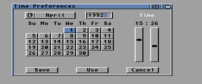
Figure 5-1: System and Application Gadgets
A gadget can be either enabled or disabled. Disabled gadgets cannot be
operated and are indicated by ghosting the gadget, that is, overlaying its
image with a pattern of dots. Gadgets may also be directly modified and
redrawn by first removing the gadget from the system.
System Gadgets Adding and Removing Gadgets
Application Gadgets
5 / About Gadgets / System Gadgets
System gadgets are predefined gadgets provided by Intuition to support
standard operations of windows and screens.  System gadgets have a
standard image and location in the borders of screens or windows.
Intuition manages the operation of all system gadgets except the close
gadget.

The drag and depth gadgets are automatically attached to each screen in
the system.  The application cannot control the creation of these gadgets,
but can control their display and operation.  Screens may be opened
"quiet", without any of the gadget imagery displayed.  Applications should
avoid covering the screen's gadgets with windows as this may prevent the
user from freely positioning the screen.  See the "Intuition Screens"
chapter for more information on the positioning and use of system gadgets
for screens.

The drag, depth, close, sizing and zoom gadgets are available to be
attached to each window.  These gadgets are not provided automatically,
the application must specify which gadgets it requires.  See the
"Intuition Windows" chapter for more information on the positioning and
use of system gadgets for windows.
5 / About Gadgets / Application Gadgets
Application gadgets imitate real life controls: they are the switches,
knobs, handles and buttons of the Intuition environment.  Gadgets can be
created with almost any imaginable type of imagery and function.  Visual
imagery for gadgets can combine text with hand drawn imagery or lines of
multiple colors.

A gadget is created by declaring and initializing a Gadget structure as
defined in <intuition/intuition.h>.  See the "Gadget Structure" section
later in this chapter for more details.

Gadgets always appear in a window or requester.  All windows and
requesters keep a list of the gadgets they contain.  Gadgets can be added
when the window or requester is opened, or they can be added or removed
from the window or requester after it is open.

As with other types of input events, Intuition notifies your application
about gadget activity by sending a message to your window's I/O channels:
the IDCMP (Window.UserPort) or the console device.  The message is sent as
an Intuition IntuiMessage structure.  The Class field of this structure is
set to IDCMP_GADGETDOWN or IDCMP_GADGETUP with the IAddress field set to
the address of the Gadget that was activated.  (See the chapter on
"Intuition Input and Output Methods" for details.)

Application gadgets can go anywhere in windows or requesters, including in
the borders, and can be any size or shape.  When application gadgets are
placed into the window's border at the time the window is opened,
Intuition will adjust the border size accordingly.  Application gadgets
are not supported in screens (although this may be simulated by placing
the gadget in a backdrop window).

Gadget size can be fixed, or can change relative to the window size.
Gadget position can be set relative to either the top or bottom border,
and either the left or right border of the window, allowing the gadget to
move with a border as the window is sized.

This flexibility provides the application designer the freedom to create
gadgets that mimic real devices, such as light switches or joysticks, as
well as the freedom to create controls that satisfy the unique needs of
the application.

 A Simple Gadget Example
5 / About Gadgets / Adding and Removing Gadgets
Gadgets may be added to a window or requester when the window or requester
is opened, or they may be added later.  To add the gadgets when a window
is opened, use the WA_Gadgets tag with the OpenWindowTagList() call.  This
technique is demonstrated in the example above.  For a requester, set the
ReqGadget field in the Requester structure to point to the first gadget in
the list.

To add or remove gadgets in a window or requester that is already open,
use AddGList() or RemoveGList().  These functions operate on gadgets
arranged in a list.  A gadget list is linked together by the NextGadget
field of the Gadget structure (see the description of the Gadget structure
later in this chapter).

AddGList() adds a gadget list that you specify to the existing gadget list
of a window or requester:

    UWORD AddGList( struct Window *window, struct Gadget *agadget,
                    unsigned long position, long numGad,
                    struct Requester *requester );

Up to numGad gadgets will be added from the gadget list you specify
beginning with agadget.  The position argument determines where your
gadgets will be placed in the existing list of gadgets for the window or
requester.  Use (~0) to add your gadget list to the end of the window or
requester's gadget list.  This function returns the actual position where
your gadgets are added in the existing list.

To remove gadgets from a window or requester use RemoveGList():

    UWORD RemoveGList( struct Window *remPtr, struct Gadget *agadget,
                       long numGad );

This function removes up to numGad gadgets from a window or requester,
beginning with the specified one.  Starting with V37, if one of the
gadgets that is being removed is the active gadget, this routine will wait
for the user to release the mouse button before deactivating and removing
the gadget.  This function returns the former position of the removed
gadget or -1 if the specified gadget was not found.

The Gadget structure should never be directly modified after it has been
added to a window or requester.  To modify a gadget, first remove it with
RemoveGList(), modify the structure as needed, and then add the gadget
back to the system with AddGList().  Finally, refresh the gadget imagery
with RefreshGList(). (See the section on "Gadget Refreshing" below for
more information.)

Some attributes of a gadget may be modified through special Intuition
functions that perform the modification.  When using such functions it is
not necessary to remove, add or refresh the gadget.  These functions, such
as NewModifyProp(), OnGadget() and OffGadget(), are described later in
this chapter.
5 Intuition Gadgets / Gadget Imagery
Gadget imagery can be rendered with a series of straight lines, a bitmap
image or no imagery at all.  In addition to the line or bitmap imagery,
gadgets may include a series of text strings.

 Hand Drawn Gadgets    Gadget Text
 Line Drawn Gadgets    Gadgets Without Imagery
5 / Gadget Imagery / Hand Drawn Gadgets
Bitmap or custom images are used as imagery for a gadget by setting the
GFLG_GADGIMAGE flag in the Flags field of the Gadget structure.  An Image
structure must be set up to manage the bitmap data.  The address of the
Image structure is placed into the gadget's GadgetRender field.  The
bitmap image will be positioned relative to the gadget's select box.  For
more information about creating Intuition images, see the chapter
"Intuition Images, Line Drawing, and Text."  For a listing of the Gadget
structure and all its flags see the "Gadget Structure" section later in
this chapter.
5 / Gadget Imagery / Line Drawn Gadgets
Gadget imagery can also be created by specifying a series of lines to be
drawn.  These lines can go around or through the select box of the gadget,
and can be drawn using any color pen and draw mode.  Multiple groups of
lines may be specified, each with its own pen and draw mode.

The Border structure is used to describe the lines to be drawn.  The
Border structure is incorporated into the gadget by clearing the
GFLG_GADGIMAGE flag in the gadget's Flags field.  The address of the
Border structure is placed into the gadget's GadgetRender field.  The
border imagery will be positioned relative to the gadget's select box.
For more information about creating a Border structure, see the chapter
"Intuition Images, Line Drawing, and Text."
5 / Gadget Imagery / Gadget Text
Gadgets may include text information in the form of a linked list of
IntuiText structures.  A pointer to the first IntuiText structure in the
list is placed in the Gadget structure's GadgetText field.  The text is
positioned relative to the top left corner of the gadget's select box.
For more information on IntuiText, see the
"Intuition Images, Line Drawing and Text" chapter.
5 / Gadget Imagery / Gadgets Without Imagery
Gadgets can be created without any defining imagery.  This type of gadget
may be used where mouse information is required but graphical definition
of the gadget is not, or where the existing graphics sufficiently define
the gadget that no additional imagery is required.  A gadget with no
imagery may be created by clearing the GFLG_GADGIMAGE flag in the gadget's
Flags field, and by setting the gadget's GadgetRender and GadgetText
fields to NULL.

The text display of a word processor is a case where mouse information is
required without any additional graphics.  If a large gadget is placed
over the text display, gadget and mouse event messages may be received at
the IDCMP (Window.UserPort) when the mouse select button is either pressed
or released.  The mouse information is used to position the pointer in the
text, or to allow the user to mark blocks of text.  The drag bar of a
window is another example of a gadget where existing imagery defines the
gadget such that additional graphics are not required.
5 Intuition Gadgets / Gadget Selection
The user operates a gadget by pressing the select button while the mouse
pointer is within the gadget's select box.  Intuition provides two ways of
notifying your program about the user operating a gadget.  If your
application needs immediate notification when the gadget is chosen, set
the GACT_IMMEDIATE flag in the gadget's Activation field.  Intuition will
send an IDCMP_GADGETDOWN message to the window's UserPort when it detects
the mouse select button being pressed on the gadget.

If the application needs notification when the gadget is released, i.e.,
when the user releases the mouse select button, set the GACT_RELVERIFY
(for "release verify") flag in the gadget's Activation field.  For boolean
gadgets, Intuition will send an IDCMP_GADGETUP message to the window's
UserPort when the mouse select button is released over a GACT_RELVERIFY
gadget.  The program will only receive the IDCMP_GADGETUP message if the
user still has the pointer positioned over the select box of the gadget
when the mouse select button is released.

If the user moves the mouse out of the gadget's select box before
releasing the mouse button an IDCMP_MOUSEBUTTONS event will be sent with a
code of SELECTUP.  This indicates the user's desire to not proceed with
the action.  Boolean gadgets that are GACT_RELVERIFY allow the user a
chance to cancel a selection by rolling the mouse off of the gadget before
releasing the select button.

String gadgets have a slightly different behavior, in that they remain
active after the mouse button has been released.  The gadget remains
active until Return or Enter is pressed, the user tabs to the next or
previous gadget, another window becomes active or the user chooses another
object with the mouse.  An IDCMP_GADGETUP message is only sent for
GACT_RELVERIFY string gadgets if the user ends the gadget interaction
through the Return, Enter or (if activated) one of the tab keys.

GACT_RELVERIFY proportional gadgets send IDCMP_GADGETUP events even if the
mouse button is released when the pointer is not positioned over the
select box of the gadget.

Gadgets can specify both the GACT_IMMEDIATE and GACT_RELVERIFY activation
types, in which case, the program will receive both IDCMP_GADGETDOWN and
IDCMP_GADGETUP messages.
5 Intuition Gadgets / Gadget Size and Position
The position and dimensions of the gadget's select box are defined in the
Gadget structure.  The LeftEdge, TopEdge, Width and Height values can be
absolute numbers or values relative to the size of the window.  When using
absolute numbers, the values are set once, when the gadget is created.
When using relative numbers, the size and position of the select box are
adjusted dynamically every time the window size changes.

The gadget image is positioned relative to the select box so when the
select box moves the whole gadget moves.  The size of the gadget image,
however, is not usually affected by changes in the select box size
(proportional gadgets are the exception).  To create a gadget image that
changes size when the select box and window change size, you have to
handle gadget rendering yourself or use a BOOPSI gadget.

 Select Box Position     Positioning Gadgets in Window Borders
 Select Box Dimension
5 / Gadget Size and Position / Select Box Position
To specify relative position or size for the gadget's select box, set or
more of the flags GFLG_RELRIGHT, GFLG_RELBOTTOM, GFLG_RELWIDTH or
GFLG_RELHEIGHT in the Flags field of the Gadget structure.  When using
GFLG_RELxxx flags, the gadget size or position is recomputed each time the
window is sized.

    Positioning the Select Box.
    ---------------------------
    With GFLG_RELxxx gadgets, all of the imagery must be contained
    within the gadget's select box.  This allows Intuition to erase the
    gadget's imagery when the window is sized.  Intuition must be able to
    erase the gadget's imagery since the gadget's position or size will
    change as the window size changes.  If the old one were not removed,
    imagery from both sizes/positions would be visible.

    If a GFLG_RELxxx gadget's imagery must extend outside of its select
    box, position another GFLG_RELxxx gadget with a larger select box
    such that all of the first gadget's imagery is within the second
    gadget's select box. This "shadow" gadget is only used to clear the
    first gadget's imagery and, as such, it should not have imagery nor
    should it generate any messages. It should also be positioned later
    in the gadget list than the first gadget so that its select box does
    not interfere with the first gadget.

The left-right position of the select box is defined by the variable
LeftEdge, which is an offset from either the left or right edge of the
display element.  The offset method is determined by the GFLG_RELRIGHT
flag.  For the LeftEdge variable, positive values move toward the right
and negative values move toward the left of the containing display
element.  If GFLG_RELRIGHT is cleared, LeftEdge is an offset (usually a
positive value) from the left edge of the display element.

If GFLG_RELRIGHT is set, LeftEdge is an offset (usually a negative value)
from the right edge of the display element.  When this is set, the
left-right position of the select box in the window is recomputed each
time the window is sized.  The gadget will automatically move with the
left border as the window is sized.

The top-bottom position of the select box is defined by the variable
TopEdge, which is an offset from either the top or bottom edge of the
display element (window or requester).  The offset method is determined by
the GFLG_RELBOTTOM flag.  For the TopEdge variable, positive values move
toward the bottom and negative values move toward the top of the
containing display element.

If GFLG_RELBOTTOM is cleared, TopEdge is an offset (usually a positive
value) from the top of the display element.  If GFLG_RELBOTTOM is set,
TopEdge is an offset (usually a negative value) from the bottom of the
display element.  When this is set, the position of the select box is
recomputed each time the window is sized.  The gadget will automatically
move with the bottom border as the window is sized.
5 / Gadget Size and Position / Select Box Dimension
The height and width of the gadget select box can be absolute or they can
be relative to the height and width of the display element in which the
gadget resides.

Set the gadget's GFLG_RELWIDTH flag to make the gadget's width relative to
the width of the window.  When this flag is set, the Width value is added
to the current window width to determine the width of the gadget select
box.  The Width value is usually negative in this case, making the width
of the gadget smaller than the width of the window.  If GFLG_RELWIDTH is
not set, Width will specify the actual width of the select box.

The actual width of the box will be recomputed each time the window is
sized.  Setting GFLG_RELWIDTH and a gadget width of zero will create a
gadget that is always as wide as the window, regardless of how the window
is sized.

The GFLG_RELHEIGHT flag has the same effect on the height of the gadget
select box.  If the flag is set, the height of the select box will be
relative to the height of the window, and the actual height will be
recomputed each time the window is sized.  If the flag is not set, the
value will specify the actual height of the select box.

Here are a few examples of gadgets that take advantage of the special
relativity modes of the select box.  Consider the Intuition window sizing
gadget.  The LeftEdge and TopEdge of this gadget are both defined relative
to the right and bottom edges of the window.  No matter how the window is
sized, the gadget always appears in the lower right corner.

For the window drag gadget, the LeftEdge and TopEdge are always absolute
in relation to the top left corner of the window.  Height of this gadget
is always an absolute quantity.  Width of the gadget, however, is defined
to be zero.  When Width is combined with the effect of the GFLG_RELWIDTH
flag, the drag gadget is always as wide as the window.

For a program with several requesters, each of which has an "OK" gadget in
the lower left corner and a "Cancel" gadget in the lower right corner, two
gadgets may be designed that will appear in the correct position
regardless of the size of the requester.  Design the "OK" and "Cancel"
gadgets such that they are relative to the lower left and lower right
corners of the requester.  Regardless of the size of the requesters, these
gadgets will appear in the correct position relative to these corners.
Note that these gadgets may only be used in one window or requester at a
time.
5 / Gadget Size and Position / Positioning Gadgets in Window Borders
Gadgets may be placed in the borders of a window.  To do this, set one or
more of the border flags in the Gadget structure and position the gadget
in the window border.  Setting these flags also tells Intuition to adjust
the size of the window's borders to accommodate the gadget.

Borders are adjusted only when the window is opened.  Although the
application can add and remove gadgets with AddGList() and RemoveGList()
after the window is opened, Intuition does not readjust the borders.

A gadget may be placed into two borders by setting multiple border flags.
If a gadget is to be placed in two borders, it only makes sense to put the
gadget into adjoining borders.  Setting both side border flags or both the
top and bottom border flags for a particular gadget, will create a window
that is all border.

See the SuperBitMap example, lines.c, in the "Intuition Windows" chapter
for an example of creating proportional gadgets that are positioned within
a window's borders.

There are circumstances where the border size will not adjust properly so
that the gadget has the correct visual appearance.  One way to correct
this problem is to place a "hidden" gadget into the border, which forces
the border to the correct size.  Such a gadget would have no imagery and
would not cause any IDCMP messages to be sent on mouse button activity.
The gadget should be placed at the end of the gadget list of the window,
so that it does not cover up any other border gadgets.

Sometimes the sizing gadget can be used to adjust the width of the
borders, as in the case of proportional gadgets in the right or bottom
border.  The proportional gadget will only increase the width of the
border by enough so that the select box of the gadget fits within the
border, no space is reserved between the gadget and the inner edge of the
window.  By placing the size gadget in both borders (using the window
flags WFLG_SIZEBRIGHT and WFLG_SIZEBBOTTOM), the prop gadget sizes can be
adjusted so that there is an even margin on all sides.  This technique is
used in the lines.c example mentioned above.


    size gadget in        size gadget in        size gadget in
     both borders         bottom border          side border
    --------------        --------------        --------------

          |     |                    ||               |     |
          |     |                    ||               |     |
          |     |                    ||               |     |
          |     |                    ||               |     |
          |     |                    ||               |     |
     _____|_____|          __________||               |_____|
          |     |               |     |               |     |
          |   /||               |   /||               |   /||
          |  / ||               |  / ||               |  / ||
          | /__||               | /__||          _____| /__||
     _____|_____|          _____|_____|          _____|_____|


   Figure 5-2: Size Gadget in Various Window Border Combinations


The border flags GACT_RIGHTBORDER, GACT_LEFTBORDER, GACT_TOPBORDER and
GACT_BOTTOMBORDER which are set in the Activation field of the Gadget
structure declare that the gadget will be positioned in the border.
Gadgets which are declared to be in the border are automatically refreshed
by Intuition whenever the window borders need to be redrawn.  This
prevents the gadget imagery from being obliterated.

Some applications forgot to declare some of their gadgets as being in the
border.  While they looked fine prior to V36, they would have had some
gadget imagery overwritten by the new style of window borders introduced
with that release.  To ensure compatibility with such applications,
Intuition attempts to identify gadgets that are substantially in the
border but do not have the appropriate border flags set.  Such gadgets are
marked for the same refresh treatment as explicit border gadgets.
Applications should not rely on this behavior, but should instead declare
their border gadgets properly.

Gadgets that are not declared to be in the border, and whose dimensions
are 1 x 1 or smaller are never marked by Intuition as being effectively in
the border.  This is because some applications tuck a small non-selectable
gadget (of size 0x0 or 1x1) into the window border, and attach imagery for
the window to that gadget.  The application does this to get automatic
refresh of that imagery, since Intuition refreshes gadget imagery when
window damage occurs.

Beginning with V36, Intuition attempts to locate gadgets within the border
that do not have the appropriate flags set.  This may cause gadgets to
appear in the border when the application has not set any of the border
flags.  Applications should not rely on this behavior, nor should they
place non-border gadgets fully or partially within the window's borders.
5 Intuition Gadgets / Gadget Highlighting
In general, the appearance of an active or selected gadget changes to
inform the user the gadget state has changed.  A highlighting method is
specified by setting one of the highlighting flags in the Gadget
structure's Flags field.

Intuition supports three methods of activation or selection highlighting:

  * Highlighting by color complementing (GFLG_GADGHCOMP)

  * Highlighting by drawing a box (GFLG_GADGHBOX)

  * Highlighting by an alternate image or border (GFLG_GADGHIMAGE)

  * No highlighting (GFLG_GADGHNONE)

One of the highlighting types or GFLG_GADGHNONE must be specified for each
gadget.

 Highlighting by Color Complementing
 Highlighting by Drawing a Box
 Highlighting with an Alternate Image or Alternate Border
5 / Gadget Highlighting / Highlighting by Color Complementing
Highlighting may be accomplished by complementing all of the colors in the
gadget's select box. In this context, complementing means the complement
of the binary number used to represent a particular color register.  For
example, if the color in color register 2 is used (binary 10) in a
specific pixel of the gadget, the complemented value of that pixel will be
the color in color register 1 (binary 01).

To use this highlighting method, set the GFLG_GADGHCOMP flag.

Only the select box of the gadget is complemented; any portion of the
text, image, or border which is outside of the select box is not
disturbed. See the chapter "Intuition Images, Line Drawing, and Text," for
more information about complementing and about color in general.
5 / Gadget Highlighting / Highlighting by Drawing a Box
To highlight by drawing a simple border around the gadget's select box,
set the GFLG_GADGHBOX bit in the Flags field.
5 / Gadget Highlighting / With an Alternate Image or Alternate Border
An alternate image may be supplied as highlighting for gadgets that use
image rendering, similarly an alternate border may be supplied for gadgets
that use border rendering.  When the gadget is active or selected, the
alternate image or border is displayed in place of the default image or
border.  For this highlighting method, set the SelectRender field of the
Gadget structure to point to the Image structure or Border structure for
the alternate display.

Specify that highlighting is to be done with alternate imagery by setting
the GFLG_GADGHIMAGE flag in the Flags field of the Gadget structure.  When
using GFLG_GADGHIMAGE, remember to set the GFLG_GADGIMAGE flag for images,
clear it for borders.

When using alternate images and borders for highlighting, gadgets rendered
with images must highlight with another image and gadgets rendered with
borders must highlight with another border.  For information about how to
create an Image or Border structure, see the chapter "Intuition Images,
Line Drawing, and Text."
5 Intuition Gadgets / Gadget Refreshing
Gadget imagery is redrawn by Intuition at appropriate times, e.g., when
the user operates the gadget.  The imagery can also be updated under
application control.

 Gadget Refreshing by Intuition    Gadget Refreshing by the Program
5 / Gadget Refreshing / Gadget Refreshing by Intuition
Intuition will refresh a gadget whenever an operation has damaged the
layer of the window or requester to which it is attached.  Because of
this, the typical application does not need to call RefreshGList() as a
part of its IDCMP_REFRESHWINDOW event handling.

Intuition's refreshing of the gadgets of a damaged layer is done through
the layer's damage list.  This means that rendering is clipped or limited
to the layer's damage region--that part of the window or requester that
needs refreshing.

Intuition directly calls the Layers library functions BeginUpdate() and
EndUpdate(), so that rendering is restricted to the proper area.
Applications should not directly call these functions under Intuition,
instead, use the BeginRefresh() and EndRefresh() calls.  Calls to
RefreshGList() or RefreshGadgets() between BeginRefresh() and EndRefresh()
are not permitted.  Never add or remove gadgets between the BeginRefresh()
and EndRefresh() calls.

For more information on BeginRefresh() and EndRefresh(), see the
"Intuition Windows" chapter and the Amiga ROM Kernel Reference Manual:
Includes and Autodocs.

Gadgets which are positioned using GFLG_RELBOTTOM or GFLG_RELRIGHT, or
sized using GFLG_RELWIDTH or GFLG_RELHEIGHT pose a problem for this
scheme.  When the window is sized, the images for these gadgets must
change, even though they are not necessarily in the damage region.
Therefore, Intuition must add the original and new visual regions for such
relative gadgets to the damage region before refreshing the gadgets.  The
result of this is that applications should ensure that any gadgets with
relative position or size do not have Border, Image or IntuiText imagery
that extends beyond their select boxes.
5 / Gadget Refreshing / Gadget Refreshing by the Program
The AddGList() function adds gadgets to Intuition's internal lists but do
not display their imagery.  Subsequently calls to RefreshGList() must be
made to draw the gadgets into the window or requester.

Programs may use RefreshGList() to update the display after making changes
to their gadgets.  The supported changes include (not an exhaustive list):
changing the GFLG_SELECTED flag for boolean gadgets to implement mutually
exclusive gadgets, changing the GadgetText of a gadget to change its
label, changing the GFLG_DISABLED flag, and changing the contents of the
StringInfo structure Buffer of a string gadget.  When making changes to a
gadget, be sure to remove the gadget from the system with RemoveGList()
before altering it.  Remember to add the gadget back and refresh its
imagery.

Boolean gadgets rendered with borders, instead of images, or highlighted
with surrounding boxes (GFLG_GADGHBOX) are handled very simply by
Intuition, and complicated transitions done by the program can get the
rendering out of phase.  Applications should avoid modifying the imagery
and refreshing gadgets that may be highlighted due to selection by the
user.  Such operations may leave pixels highlighted when the gadget is no
longer selected.  The problems with such transitions can often be avoided
by providing imagery, either image or border, that covers all pixels in
the select box.  For GFLG_GADGHIMAGE gadgets, the select imagery should
cover all pixels covered in the normal imagery.

 Updating a Gadget's Imagery    gadget Refresh Function
5 / / Gadget Refreshing by the Program / Updating a Gadget's Imagery
The RefreshGList() function was designed to draw gadgets from scratch, and
assumes that the underlying area is blank.  This function cannot be used
blindly to update gadget imagery.  The typical problem that arises is that
the application cannot change a gadget from selected to unselected state
(or from disabled to enabled state) and have the imagery appear correct.
However, with a little care, the desired results can be obtained.

Depending on the imagery you select for your gadget, the rendering of one
state may not completely overwrite the rendering of a previous one.  For
example, consider a button which consists of a complement-highlighted
boolean gadget, whose imagery is a surrounding Border and whose label is
an IntuiText.  Attempting to visually unselect such a gadget by clearing
its GFLG_SELECTED flag and refreshing it will leave incorrect imagery
because RefreshGList() just redraws the border and text, and never knows
to erase the field area around the text and inside the gadget.  That area
will remain complemented from before.

One solution is to use a gadget whose imagery is certain to overwrite any
imagery left over from a different state.  Disabling a gadget or
highlighting it with complement mode affects the imagery in the entire
select box.  To overwrite this successfully, the gadget's imagery
(GadgetRender) should be an Image structure which fully covers the select
box.  Such a gadget may be highlighted with color complementing
(GFLG_GADGHCOMP), or with an alternate image (GFLG_GADGHIMAGE) for its
SelectRender.  Or, for a gadget which will never be disabled but needs to
be deselected programmatically, you may also use a Border structure for
its GadgetRender, and an identically-shaped (but differently colored)
Border for its SelectRender.

The other technique is to pre-clear the underlying area before
re-rendering the gadget.  To do this, remove the gadget, erase the
rectangle of the gadget's select area, change the GFLG_SELECTED or the
GFLG_DISABLED flag, add the gadget back, and refresh it.

If the gadget has a relative size and/or position (i.e., if of the
GFLG_RELxxx flags are used), then the application will need to compute the
rectangle of the gadget's select area based on the window's current width
and/or height.  Since the window size is involved in the calculation, it
is important that the window not change size between the call to
RemoveGList() and the call to RectFill().  To ensure this, the application
should set IDCMP_SIZEVERIFY so that Intuition will first notify you before
beginning a sizing operation.  (Note that applications using any of the
IDCMP verify events such as IDCMP_SIZEVERIFY should not delay long in
processing such events, since that holds up the user, and also Intuition
may give up and stop waiting for you).
5 / / Gadget Refreshing by the Program / Gadget Refresh Function
Use the RefreshGList() function to refresh one or more gadgets in a window
or requester.

    void RefreshGList( struct Gadget *gadgets, struct Window *window,
                       struct Requester *requester, long numGad );

This function redraws no more than numGad gadgets, starting with the
specified gadget, in a window or requester.  The application should
refresh any gadgets after adding them.  The function should also be used
after the application has modified the imagery of the gadgets to display
the new imagery.
5 Intuition Gadgets / Gadget Enabling and Disabling
A gadget may be disabled so that it cannot be chosen by the user.  When a
gadget is disabled, its image is ghosted.  A ghosted gadget is overlaid
with a pattern of dots, thereby making the imagery less distinct.  The
dots are drawn into the select box of the gadget and any imagery that
extends outside of the select box is not affected by the ghosting.

The application may initialize whether a gadget is disabled by setting the
GFLG_DISABLED flag in the Gadget structure's Flags field before a gadget
is submitted to Intuition.  Clear this flag to create an enabled gadget.

After a gadget is submitted to Intuition for display, its current enable
state may be changed by calling OnGadget() or OffGadget().  If the gadget
is in a requester, the requester must currently be displayed when calling
these functions.

    void OnGadget ( struct Gadget *gadget, struct Window *window,
                    struct Requester *requester );
    void OffGadget( struct Gadget *gadget, struct Window *window,
                    struct Requester *requester );

Depending on what sort of imagery you choose for your gadget, OnGadget()
may not be smart enough to correct the gadget's displayed imagery.  See
the section on "Updating a Gadget's Imagery" for more details.

Multiple gadgets may be enabled or disabled by calling OnGadget() or
OffGadget() for each gadget, or by removing the gadgets with
RemoveGList(), setting or clearing the GFLG_DISABLED flag on each,
replacing the gadgets with AddGList(), and refreshing with RefreshGList().
5 Intuition Gadgets / Gadget Pointer Movements
If the GACT_FOLLOWMOUSE flag is set for a gadget, the application will
receive mouse movement broadcasts as long as the gadget is active. This
section covers the behavior of proportional, boolean and string gadgets,
although there are major caveats in some cases:

  * Unlike IDCMP_GADGETUP and IDCMP_GADGETDOWN IntuiMessages, the
    IAddress field of an IDCMP_MOUSEMOVE IntuiMessage does not point to
    the gadget.  The application must track the active gadget (this
    information is readily obtained from the IDCMP_GADGETDOWN message)
    instead of using the IAddress field.


	Right                          Wrong
        -----                          -----
        imsg=GetMsg(win->UserPort);    imsg=GetMsg(win->UserPort);
        class=imsg->Class;             class=imsg->Class;
        code=imsg->Code;               code=imsg->Code;
        /* OK */                       /* ILLEGAL ! */
        iaddress=imsg->IAddress;       gadid=((struct Gadget *)
                                               imsg->IAddress)->GadgetID;
        ReplyMsg(imsg);                ReplyMsg(imsg);


    Using the code in the left column, it is acceptable to get the
    address of a gadget with gadid=((struct Gadget *)iaddress)->GadgetID
    but only after you have checked to make sure the message is an
    IDCMP_GADGETUP or IDCMP_GADGETDOWN.

  * Boolean gadgets only receive mouse messages if both GACT_RELVERIFY
    and GACT_FOLLOWMOUSE are set.  Those cases described below with
    GACT_RELVERIFY cleared do not apply to boolean gadgets.

  * In general, IDCMP_MOUSEMOVE messages are sent when the mouse changes
    position while the gadget is active.  Boolean and proportional
    gadgets are active while the mouse button is held down, thus mouse
    move messages will be received when the user "drags" with the mouse.
    String gadgets are active until terminated by keyboard entry or
    another object becomes active (generally by user clicking the other
    object).  GACT_FOLLOWMOUSE string gadgets will generate mouse moves
    the entire time they are active, not just when the mouse button is
    held.

The broadcasts received differ according to the gadget's flag settings.
If using the GACT_IMMEDIATE and GACT_RELVERIFY activation flags, the
program gets a gadget down message, receives mouse reports
(IDCMP_MOUSEMOVE) as the mouse moves, and receives a gadget up message
when the mouse button is released.  For boolean gadgets, the mouse button
must be released while the pointer is over the gadget. If the button is
not released over the boolean gadget, an IDCMP_MOUSEBUTTONS message with
the SELECTUP qualifier will be sent.

If only using the GACT_IMMEDIATE activation flag, the program gets a
gadget down message and receives mouse reports as the mouse moves. The
mouse reports will stop when the user releases the mouse select button.
This case does not apply to boolean gadgets as GACT_RELVERIFY must be set
for boolean gadgets to receive mouse messages. If only using the
GACT_RELVERIFY activation flag, the program gets mouse reports followed by
an up event for a gadget.  For boolean gadgets, the IDCMP_GADGETUP event
will only be received if the button was released while the pointer was
over the gadget.  If the button is not released over the boolean gadget, a
IDCMP_MOUSEBUTTONS message with the SELECTUP qualifier will be received if
the program is receiving these events.

If neither the GACT_IMMEDIATE nor the GACT_RELVERIFY activation flags are
set, the program will only receive mouse reports.  This case does not
apply to boolean gadgets  as GACT_RELVERIFY must be set for boolean
gadgets to receive mouse messages.
5 Intuition Gadgets / Gadget Structure
Here is the specification for the Gadget structure defined in
<intuition/intuition.h>.  You create an instance of this structure for
each gadget you place in a window or requester:

    struct Gadget
        {
        struct Gadget *NextGadget;
        WORD LeftEdge, TopEdge;
        WORD Width, Height;
        UWORD Flags;
        UWORD Activation;
        UWORD GadgetType;
        APTR GadgetRender;
        APTR SelectRender;
        struct IntuiText *GadgetText;
        LONG MutualExclude;
        APTR SpecialInfo;
        UWORD GadgetID;
        APTR UserData;
        };

NextGadget
    Applications may create lists of gadgets that may be added to a
    window or requester with a single instruction.  NextGadget is a
    pointer to the next gadget in the list.  The last gadget in the list
    should have a NextGadget value of NULL.

    When gadgets are added or removed, Intuition will modify the
    appropriate NextGadget fields to maintain a correctly linked list of
    gadgets for that window or requester.  However, removing one or more
    gadgets does not reset the last removed gadget's NextGadget field to
    NULL.

LeftEdge, TopEdge, Width, Height
    These variables describe the location and dimensions of the select
    box of the gadget.  Both location and dimensions can be either
    absolute values or else relative to the edges and size of the window
    or requester that contains the gadget.

    LeftEdge and TopEdge are relative to one of the corners of the
    display element, according to how GFLG_RELRIGHT and GFLG_RELBOTTOM
    are set in the Flags variable (see below).

    Width and Height are either absolute dimensions or a negative
    increment to the width abd height of a requester or a window,
    according to to how the GFLG_RELWIDTH and GFLG_RELHEIGHT flags are
    set (see below).

Flags
    The Flags field is shared by the program and Intuition.  See the
    section below on "Gadget Flags" for a complete description of all the
    flag bits.

Activation
    This field is used for information about some gadget attributes.  See
    the "Gadget Activation Flags" section below for a description of the
    various flags.

GadgetType
    This field contains information about gadget type and in what sort of
    display element the gadget is to be displayed.  One of the following
    flags must be set to specify the type:

    GTYP_BOOLGADGET
        Boolean gadget type.

    GTYP_STRGADGET
        String gadget type.  For an integer gadget, also set the
        GACT_LONGINT flag.  See the "Gadget Activation Flags" section
        below.

    GTYP_PROPGADGET
        Proportional gadget type.

    GTYP_CUSTOMGADGET
        Normally not set by the application.  Used by custom BOOPSI
        gadget types, discussed in the "BOOPSI" chapter.

    The following gadget types may be set in addition to one of the above
    types.  None of the following types are required:

    GTYP_GZZGADGET
        If the gadget is placed in a GimmeZeroZero window, setting this
        flag will place the gadget in the border layer, out of the inner
        window.  If this flag is not set, the gadget will go into the
        inner window.  Do not set this bit if this gadget is not placed
        in a GimmeZeroZero window.

    GTYP_REQGADGET
        Set this bit if this gadget is placed in a requester.

GadgetRender
    A pointer to the Image or Border structure containing the graphics
    imagery of this gadget.  If this field is set to NULL, no rendering
    will be done.

    If the graphics of this gadget are implemented with an Image
    structure, this field should contain a pointer to that structure and
    the GFLG_GADGIMAGE flag must be set.  If a Border structure is used,
    this field should contain a pointer to the Border structure, and the
    GFLG_GADGIMAGE bit must be cleared.

SelectRender
    If the application does not use an alternate image for highlighting,
    set this field to NULL.  Otherwise, if the flag GFLG_GADGHIMAGE is
    set, this field must contain a pointer to an Image or Border
    structure.  The GFLG_GADGIMAGE flag determines the type of the
    rendering. Provide a pointer to an IntuiText structure to include a
    text component to the gadget.  Multiple IntuiText structures may be
    chained.  Set this field to NULL if the gadget has no associated text.

GadgetText
    Provide a pointer to an IntuiText structure to include a text
    component to the gadget.  Multiple IntuiText structures may be
    chained.  Set this field to NULL if the gadget has no associated text.

    The offsets in the IntuiText structure are relative to the top left
    of the gadget's select box.

MutualExclude
    This field is currently ignored by Intuition, but is reserved. Do not
    store information here. Starting with V36, if the GadgetType is
    GTYP_CUSTOMGADGET this field is used to point to a Hook for the
    custom gadget.

SpecialInfo
    SpecialInfo contains a pointer to an extension structure which
    contains the special information needed by the gadget.

    If this is a proportional gadget, this variable must contain a
    pointer to an instance of a PropInfo data structure. If this is a
    string or integer gadget, this variable must contain a pointer to an
    instance of a StringInfo data structure. If this is a boolean gadget
    with GACT_BOOLEXTEND activation, this variable must contain a pointer
    to an instance of a BoolInfo data structure. Otherwise, this variable
    is ignored.

GadgetID
    This variable is for application use and may contain any value.  It
    is often used to identify the specific gadget within an event
    processing loop.  This variable is ignored by Intuition.

UserData
    This variable is for application use and may contain any value.  It
    is often used as a pointer to a data block specific to the
    application or gadget.  This variable is ignored by Intuition.

 Gadget Flags    Gadget Activation Flags
5 / Gadget Structure / Gadget Flags
The following are the flags that can be set in the Flags variable of the
Gadget structure.  There are four highlighting methods to choose from.
These determine how the gadget imagery will be changed when the gadget is
selected.  One of these four flags must be set.

GFLG_GADGHNONE
    Set this flag for no highlighting.

GFLG_GADGHCOMP
    This flag chooses highlighting by complementing all of the bits
    contained within the gadget's select box.

GFLG_GADGHBOX
    This flag chooses highlighting by drawing a complemented box around
    the gadget's select box.

GFLG_GADGHIMAGE
    Set this flag to indicate highlighting with an alternate image.


In addition to the highlighting flags, these other values may be set in
the Flags field of the Gadget structure.

GFLG_GADGIMAGE
    If the gadget has a graphic, and it is implemented with an Image
    structure, set this bit.  If the graphic is implemented with a Border
    structure, make sure this bit is clear.  This bit is also used by
    SelectRender to determine the rendering type.

GFLG_RELBOTTOM
    Set this flag if the gadget's TopEdge variable describes an offset
    relative to the bottom of the display element (window or requester)
    containing it.  A GFLG_RELBOTTOM gadget moves automatically as its
    window is made taller or shorter.  Clear this flag if TopEdge is
    relative to the top of the display element.  If GFLG_RELBOTTOM is
    set, TopEdge should contain a negative value, which will position it
    up from the bottom of the display element.

GFLG_RELRIGHT
    Set this flag if the gadget's LeftEdge variable describes an offset
    relative to the right edge of the display element containing it.  A
    GFLG_RELRIGHT gadget moves automatically as its window is made wider
    or narrower.  Clear this flag if LeftEdge is relative to the left
    edge of the display element.  If GFLG_RELRIGHT is set, LeftEdge
    should contain a negative value, which will position the gadget left
    of the right edge of the display element.

GFLG_RELWIDTH
    Set this flag for "relative gadget width."  If this flag is set, the
    width of the gadget's select box changes automatically whenever the
    width of its window changes.  When using GFLG_RELWIDTH, set the
    gadget's Width to a negative value.  This value will be added to the
    width of the gadget's display element (window or requester) to
    determine the actual width of the gadget's select box.

GFLG_RELHEIGHT
    Set this flag for "relative gadget height."  If this flag is set, the
    height of the gadget's select box changes automatically whenever the
    height of its window changes.  When using GFLG_RELHEIGHT, set the
    gadget's Height to a negative value.  This value will be added to the
    height of the gadget's display element (window or requester) to
    determine the actual height of the gadget's select box.

GFLG_SELECTED
    Use this flag to preset the on/off selected state for a toggle-select
    boolean gadget (see the discussion of the GACT_TOGGLESELCT flag
    below).  If the flag is set, the gadget is initially selected and is
    highlighted.  If the flag is clear, the gadget starts off in the
    unselected state.  To change the selection state of one or more
    gadgets, change their GFLG_SELECTED bits as appropriate, add them
    back and refresh them.  However, see the section on
    "Updating a Gadget's Imagery" for important details.

GFLG_DISABLED
    If this flag is set, this gadget is disabled. To enable or disable a
    gadget after the gadget has been added to the system, call the
    routines OnGadget() and OffGadget().  The GFLG_DISABLED flag can be
    programmatically altered in much the same way as GFLG_SELECTED above.
    See the section on "Updating a Gadget's Imagery" for important
    details.

GFLG_STRINGEXTEND
    The StringInfo Extension field points to a valid StringExtend
    structure.  Use of this structure is described later in the
    "String Gadget Type" section of this chapter.  This flag is ignored
    prior to V37, see GACT_STRINGEXTEND for the same functionality under
    V36.  Note that GACT_STRINGEXTEND is not ignored prior to V36 and
    should only be set in V36 or later systems.

GFLG_TABCYCLE
    This string participates in cycling activation with the tab (or
    shifted tab) key.  If this flag is set, the tab keys will de-activate
    this gadget as if the Return or Enter keys had been pressed, sending
    an IDCMP_GADGETUP message to the application, then the next string
    gadget with GFLG_TABCYCLE set will be activated.  Shifted tab
    activates the previous gadget.
5 / Gadget Structure / Gadget Activation Flags
These flags may be set in the Activation field of the Gadget structure.

GACT_TOGGLESELECT
    This flag applies only to boolean gadgets, and tells Intuition that
    this is to be a toggle-select gadget, not a hit-select one.  Preset
    the selection state with the gadget flag GFLG_SELECTED (see above).
    The program may check if the gadget is in the selected state by
    examining the GFLG_SELECTED flag at any time.

GACT_IMMEDIATE
    If this bit is set, the program will be sent an IDCMP_GADGETDOWN
    message when the gadget is first picked.  The message will be sent
    when the user presses the mouse select button.

GACT_RELVERIFY
    This is short for "release verify."  If this bit is set, the program
    will be sent an IDCMP_GADGETUP message when the gadget is
    deactivated.  IDCMP_GADGETUP will be sent for boolean gadgets when
    the user releases the mouse select button while the pointer is over
    the select box, for proportional gadgets whenever the user releases
    the mouse select button (regardless of the pointer position), and for
    string and integer gadgets when the user completes the text entry by
    pressing return or tabbing to the next gadget (where supported).

    For boolean gadgets, if the user releases the mouse button while the
    pointer is outside of the gadget's select box IDCMP_GADGETUP will not
    be generated.  Instead, the program will receive an
    IDCMP_MOUSEBUTTONS event with the SELECTUP code set.  For string
    gadgets, if the user deactivates the gadget by clicking elsewhere, it
    may not be possible to detect.

GACT_ENDGADGET
    This flag pertains only to gadgets attached to requesters.  If a
    gadget with the GACT_ENDGADGET flag set is chosen by the user the
    requester will be terminated as if the application had called the
    EndRequest() function.

    See the chapter "Intuition Requesters and Alerts," for more
    information about requester gadget considerations.

GACT_FOLLOWMOUSE
    These flags may be set in the Activation field of the Gadget
    structure. As long as a gadget that has this flag set is active, the
    program will receive mouse position messages for each change of mouse
    position.  For GTYP_BOOLGADGET gadgets, GACT_RELVERIFY must also be
    set for the program to receive mouse events.


The following flags are used to place application gadgets into a specified
window border.  Intuition will adjust the size of a window's borders
appropriately provided these gadgets are set up with a call to
OpenWindow(), OpenWindowTags() or OpenWindowTagList().  Intuition knows to
refresh gadgets marked with these flags when the window border is changed,
e.g., when the window is activated.  For GimmeZeroZero windows, the
GTYP_GZZGADGET flag must also be set for border gadgets.

GACT_RIGHTBORDER
    If this flag is set, the gadget is placed in the right border of the
    window and the width and position of this gadget are used in deriving
    the width of the window's right border.

GACT_LEFTBORDER
    If this flag is set, the gadget is placed in the left border of the
    window and the width and position of this gadget are used in deriving
    the width of the window's left border.

GACT_TOPBORDER
    If this flag is set, the gadget is placed in the top border of the
    window and the height and position of this gadget are used in
    deriving the height of the window's top border.

GACT_BOTTOMBORDER
    If this flag is set, the gadget is placed in the bottom border of the
    window and the height and position of this gadget are used in
    deriving the height of the window's bottom border.


The following flags apply only to string gadgets:

GACT_STRINGCENTER
    If this flag is set, the text in a string gadget is centered within
    the select box.

GACT_STRINGRIGHT
    If this flag is set, the text in a string gadget is right justified
    within the select box.

GACT_STRINGLEFT
    This "flag" has a value of zero.  By default, the text in a string
    gadget is left justified within the select box.

GACT_LONGINT
    If this flag is set, the user can construct a 32-bit signed integer
    value in a normal string gadget. The input buffer of the string
    gadget must be initialized with an ASCII representation of the
    starting integer value.

GACT_ALTKEYMAP
    These flags may be set in the Activation field of the Gadget
    structure.  A pointer to the keymap must be placed in the StringInfo
    structure variable AltKeyMap.

GACT_BOOLEXTEND
    This flag applies only to boolean gadgets.  If this flag is set, then
    the boolean gadget has a BoolInfo structure associated with it.  A
    pointer to the BoolInfo structure must be placed in the SpecialInfo
    field of the Gadget structure.

GACT_STRINGEXTEND
    This is an obsolete flag originally defined in V36.  It applies only
    to string gadgets and indicates that StringInfo.Extension points to a
    valid StringExtend structure.  Although this flag works, it is not
    ignored prior to V36 as it should be in order to be backward
    compatible.  This flag is replaced by GFLG_STRINGEXTEND in V37.
    GFLG_STRINGEXTEND performs the same function and is properly ignored
    on systems prior to V36.
5 Intuition Gadgets / Boolean Gadget Type
A boolean gadget gets yes/no or on/off responses from the user.  To make a
boolean gadget set the GadgetType field to GTYP_BOOLGADGET in the Gadget
structure.

Boolean gadgets come in two types: hit-select and toggle-select.
Hit-select gadgets are only active while the user holds down the mouse
select button.  When the button is released, the gadget is unhighlighted.
Action buttons, such as "OK" and "Cancel", are hit-select.

Toggle-select gadgets become selected when the user clicks them.  To
"unselect" the gadget, the user has to click the gadget again.  Switches,
such as a checkbox, are toggle-select.

Set the GACT_TOGGLESELECT flag in the Activation field of the Gadget
structure to create a toggle-select gadget.

The GFLG_SELECTED flag in Gadget structure Flags field determines the
initial and current on/off selected state of a toggle-select gadget.  If
GFLG_SELECTED is set, the gadget will be highlighted.  The application can
set the GFLG_SELECTED flag before submitting the gadget to Intuition.  The
program may examine this flag at any time to determine the current state
of this gadget.

Try to make the imagery for toggle-select gadgets visually distinct from
hit-select gadgets so that their operation can be determined by the user
through visual inspection.

 Masked Boolean Gadgets    BoolInfo Structure    Mutual Exclude
5 / Boolean Gadget Type / Masked Boolean Gadgets
Imagery for boolean gadgets is rectangular by default, but non-rectangular
boolean gadgets are possible, with some restrictions. An auxiliary bit
plane, called a mask, may be associated with a boolean gadget. When the
user clicks within the select box of the gadget, a further test is made to
see if the chosen point is contained within the mask. Only if it is, does
the interaction count as a gadget hit.

With masked boolean gadgets, if the gadget has highlight type
GFLG_GADGHCOMP then the complement rendering is restricted to the mask.
This allows for non-rectangular shapes, such as an oval gadget which
highlights only within the oval.

There are some shortcomings to non-rectangular boolean gadgets.  For
instance, the gadget image is not rendered through the mask.  Images are
rectangular blocks, with all bits rendered.  In the case of an oval mask,
the image will be rendered in the corner areas even though they are
outside of the oval.  Also, it is not possible to mask out the select box,
thus non-rectangular masked gadgets cannot overlap in the masked area.
Therefore, such gadgets can't be crowded together without care.  Likewise,
the ghosting of a disabled gadget does not respect the mask, so ghosting
of the corners around an oval may be visible, depending on the colors
involved.

To use a masked boolean gadget, fill out an instance of the BoolInfo
structure.  This structure contains a pointer to the mask plane data.  The
application must also set the GACT_BOOLEXTEND flag in the gadget's
Activation field.
5 / Boolean Gadget Type / BoolInfo Structure
This is the special data structure required for a masked boolean gadget. A
pointer to this structure must be placed in the gadget's SpecialInfo field
for a masked boolean gadget.

    struct BoolInfo
        {
        UWORD  Flags;
        UWORD  *Mask;
        ULONG  Reserved;
        };

Flags
    Flags must be given the value BOOLMASK.

Mask
    This is a bit mask for highlighting and picking the gadget.
    Construct the mask as a single plane of image data.  The image's
    width and height are determined by the width and height  of the
    gadget's select box.  The mask data must be in Chip memory.

Reserved
    Set this field to NULL.
5 / Boolean Gadget Type / Mutual Exclude
Mutual exclusion of boolean gadgets (sometimes referred to as "radio
buttons") is not directly supported by Intuition.  This section describes
the method an application should use to implement this feature.  It is up
to the application to handle the manipulation of excluded gadgets in an
Intuition compatible way.  The program must proceed with caution so as to
maintain the synchronization of the gadget and its imagery.  The rules
provided in this section for the implementation of mutual exclude gadgets
minimize the risk and complexity of the application.  Other techniques may
seem to work with simple input, but may fail in subtle ways when stressed.

 Gadget Type for Mutual Exclusion
 Gadget Highlighting for Mutual Exclusion
 Handling of Mutually Exclusive Gadgets
5 / / Mutual Exclude / Gadget Type for Mutual Exclusion
To implement mutual exclusion, gadgets must be hit-select (not
GACT_TOGGLESELECT) boolean gadgets, with the GACT_IMMEDIATE activation
type (never GACT_RELVERIFY).  All state changes must be executed upon
receiving the IDCMP_GADGETDOWN message for the gadgets.  Failure to do
this could introduce subtle out-of-phase imagery problems.
5 / / Mutual Exclude / Gadget Highlighting for Mutual Exclusion
When using complement mode highlighting, the image supplied must be at
least the size of the complemented area (the gadget select box).  An
extended boolean gadget with a mask may be used to constrain the area that
is highlighted.

Alternate image highlighting may be used provided the two images have
exactly the same size and position.  Likewise, a border and alternate
border may be used provided the two borders are identical in shape and
position, differing only in color.

Do not use other combinations for mutual exclude gadgets such as a gadget
with a border that uses complement mode highlighting or a gadget which
uses highlighting by drawing a box.  See the section on
"Updating a Gadget's Imagery" for more information.
5 / / Mutual Exclude / Handling of Mutually Exclusive Gadgets
Use RemoveGList() to remove the boolean gadget from the window or
requester.  Set or clear the GFLG_SELECTED flag to reflect the displayed
state of the gadget.  Replace the gadget using AddGList() and refresh its
imagery with RefreshGList().  Of course, several gadgets may be processed
with a single call to each of these functions.
5 Intuition Gadgets / Proportional Gadget Type
Proportional gadgets allow an application to get or display an amount,
level, or position by moving a slidable knob within a track.  They are
called proportional gadgets because the size and position of the knob is
proportional to some application-defined quantity, for example the size of
a page, and how much and which part of the page is currently visible.

An example of using proportional gadgets is available in the "Intuition
Windows" chapter.  The SuperBitMap window example, lines.c, uses
proportional gadgets to control the position of the bitmap within the
window.

Proportional gadgets are made up of a container, which is the full size of
the gadget, and a knob, that travels within the container.  Changing the
current value of the gadget is done by dragging the knob, or clicking in
the container around the knob.  Dragging the knob performs a smooth
transition from one value to the next, while clicking in the container
jumps to the next page or setting.  The KNOBHIT flag in the PropInfo
structure is available to allow the program to determine if the gadget was
changed by dragging the knob or by clicking in the container.  If the flag
is set, the user changed the value by dragging the knob.

Proportional gadgets allow display and control of fractional settings on
the vertical axis, the horizontal axis or both.  While the number of
settings has a theoretical limit of 65,536 positions, the actual
positioning of the gadget through sliding the knob is limited by the
resolution of the screen.  Further control is available by clicking in the
container, although this often is not convenient for the user.  Button or
arrow gadgets are often provided for fine tuning of the setting of the
gadget.

 New 3D Look Proportional Gadgets
 Logical Types of Proportional Gadgets
 Proportional Gadget Components
 Initialization of a Proportional Gadget
 Modifying an Existing Proportional Gadget
5 / Proportional Gadget Type / New 3D Look Proportional Gadgets
Set the PROPNEWLOOK flag in the PropInfo Flags field to get the new 3D
look.  The new 3D look proportional gadgets have a dithered pattern in the
container and updated knob imagery.  The knob dimensions are also slightly
changed for those proportional gadgets with a border.

Set the PROPBORDERLESS flag in the PropInfo Flags field if no border
around the container is desired.  Setting this flag with PROPNEWLOOK will
provide a 3D knob.

    Proportional gadgets and the New 3D Look.
    -----------------------------------------
    To create prop gadgets that have the same look as the rest of the
    system, set the PROPNEWLOOK flag and clear the PROPBORDERLESS flag.
    It is recommended that applications follow this guideline to maintain
    a compatible look and feel for all gadgets in the system.

New look proportional gadgets placed in the border of a window will change
to an inactive display state when the window is deactivated.  This only
happens to gadgets that have the PROPNEWLOOK flag set and are in the
window border.  In the inactive state, the knob is filled with
BACKGROUNDPEN.
5 / Proportional Gadget Type / Logical Types of Proportional Gadgets
There are two usual ways in which proportional gadgets are used
(corresponding to the scroller and slider gadgets of the GadTools
library).  The only difference between sliders and scrollers is the way
they are managed internally by the application.  The GadTools library
provides a high level interface to proportional gadgets, simplifying the
management task for these types of objects.

 Scrollers    Sliders
5 / / Logical Types of Proportional Gadgets / Scrollers
The scroller controls and represents a limited window used to display a
large amount of data.  For instance, a text editor may be operating on a
file with hundreds of lines, but is only capable of displaying twenty or
thirty lines at a time.

In a scroller, the container of the gadget is analogous to the total
amount of data, while the knob represents the window.  (Note that window
here is used as an abstract concept and does not necessarily mean
Intuition window.  It just means a display area reserved for viewing the
data.)

The size of the knob with respect to its container is proportional to the
size of the window with respect to the total data.  Thus, if the window
can display half the data, the knob should be half the size of the
container.  When the amount of data is smaller than the window size, the
knob should be as large as its container.

The position of the knob with respect to its container is also
proportional to the position of the window with respect to the total data.
Thus, if the knob starts half way down the container, the top of the
window should display information half way into the data.

Scrollers may be one or two dimensional.  One dimensional scrollers are
used to control linear data; such as a text file, which can be viewed as a
linear array of strings.  Such scrollers only slide on a single axis.

Two dimensional scrollers are used to control two dimensional data, such
as a large graphic image.  Such a scroller can slide on both the
horizontal and vertical axes, and the knob's horizontal and vertical size
and position should be proportional to the window's size and position in
the data set.

Multi-dimensional data may also be controlled by a number of one
dimensional scrollers, one for each axis.  The Workbench windows provide
an example of this, where one scroller is used for control of the x-axis
of the window and another scroller is used for control of the y-axis of
the window.  In this case, the size and position of the knob is
proportional to the size and position of the axis represented by the
gadget.

If the window has a sizing gadget and has a proportional gadget is the
right or bottom border, the sizing gadget is usually placed into the
border containing the proportional gadget, as the border has already been
expanded to contain the gadget.  If the window has proportional gadgets in
both the right and the bottom borders, place the sizing gadget into both
borders.  This creates evenly sized borders that match the height and
width of the sizing gadget, i.e. it is only done for visual effect.
5 / / Logical Types of Proportional Gadgets / Sliders
The slider is used to pick a specific value within a set.  Usually the set
is ordered, but this is not required.  An example of this would be
choosing the volume of a sound, the speed of an animation or the
brightness of a color.  Sliders can move on either the vertical or
horizontal axis.  A slider that moves on both the horizontal and the
vertical axis could be created to choose two values at once.

An example slider which picks an integer between one and ten, should have
the following attributes:

  * It should slide on only one axis.

  * Values should be evenly distributed over the length of the slider.

  * Clicking in the container to either side of the knob should increase
    (or decrease) the value by one unit.

Stylistically, sliding the knob to the right or top should increase the
value, while sliding it to the left or down should decrease the value.
Note that the orientation of proportional gadgets is correct for scrollers
(where the minimum value is topmost or leftmost), but is vertically
inverted for sliders.  Thus, well-behaved vertical sliders need to invert
their value somewhere in the calculations (or else the maximum will end up
at the bottom).
5 / Proportional Gadget Type / Proportional Gadget Components
A proportional gadget has several components that work together. They are
the container, the knob, the pot variables and the body variables.

 The Container         Using the Body and Pot Values
 The Knob              Functions for Using a Scroller
 The Pot Variables     Functions for Using a Slider
 The Body Variables
5 / / Proportional Gadget Components / The Container
The container is the area in which the knob can move.  It is actually the
select box of the gadget.  The size of the container, like that of any
other gadget select box, can be relative to the size of the window.  The
position of the container can be relative to any of the Intuition window's
border.

Clicking in the container around the knob will increment or decrement the
value of the gadget (the pot variables) by the appropriate amount
(specified in the body variables).  The knob will move towards the point
clicked when action is taken.
5 / / Proportional Gadget Components / The Knob
The knob may be manipulated by the user to quickly change the
pot variables.  The knob acts like a real-world proportional control.  For
instance, a knob restricted to movement on a single axis can be thought of
as a control such as the volume knob on a radio.  A knob that moves on
both axes is analogous to the control stick of an airplane.

The user can directly move the knob by dragging it on the vertical or
horizontal axis.  The knob may be indirectly moved by clicking within the
select box around the knob.  With each click, the pot variable is
increased or decreased by one increment, defined by the settings of the
body variables.

The current position of the knob reflects the pot value. A pot value of
zero will place the knob in the top or leftmost position, a value of
MAXPOT will place the knob at the bottom or rightmost position.

The application can provide its own imagery for the knob or it may use
Intuition's auto-knob.  The auto-knob is a rectangle that changes its
width and height according to the current body settings.  The auto-knob is
proportional to the size of the gadget.  Therefore, an auto-knob can be
used in a proportional gadget whose size is relative to the size of the
window, and the knob will maintain the correct size, relative to the size
of the container.

    Use Separate Imagery for Proportional Gadgets.
    ----------------------------------------------
    These Image structures may not be shared between proportional
    gadgets, each must have its own. Again, do not share the Image
    structures between proportional gadgets. This does not work, either
    for auto-knob or custom imagery.

    Use Only One Image for the Knob.
    --------------------------------
    Proportional gadget knob images may not be a list of images.  These
    must be a single image, initialized and ready to display if a custom
    image is used for the knob.
5 / / Proportional Gadget Components / The Pot Variables
The HorizPot and VertPot variables contain the actual proportional values
entered into or displayed by the gadget. The word pot is short for
potentiometer, which is an electrical analog device used to adjust a value
within a continuous range.

The proportional gadget pots allow the program to set the current position
of the knob within the container, or to read the knob's current location.

The pot variable is a 16-bit, unsigned variable that contains a value
ranging from zero to 0xFFFF. For clarity, the constant MAXPOT is
available, which is equivalent to 0xFFFF. A similar constant MAXBODY is
available for the body variables. As the pot variables are only 16 bits,
the resolution of the proportional gadgets has a maximum of 65,536
positions (zero to 65,535).

The values represented in the pot variables are usually translated or
converted to a range of numbers more useful to the application.  For
instance, if a slider covered the range one to three, pot values of zero
to 16,383 would represent one, values of 16,384 to 49,151 would represent
two and values of 49,152 to 65,535 would represent three.  The method of
deriving these numbers is fairly complex, refer to the sample code below
for more information.

There are two pot variables, as proportional gadgets are adjustable on the
horizontal axis, the vertical axis or both.  The two pot variables are
independent and may be initialized to any 16-bit, unsigned value.

Pot values change while the user is manipulating the gadget.  The program
may read the values in the pots at any time after it has submitted the
gadget to the user via Intuition.  The values always have the current
settings as adjusted by the user.
5 / / Proportional Gadget Components / The Body Variables
The HorizBody and VertBody variables describe the standard increment by
which the pot variables change and the relative size of the knob when
auto-knob is used.  The increment, or typical step value, is the value
added to or subtracted from the internal knob position when the user clicks
in the container around the knob.  For example, a proportional gadget for
color mixing might allow the user to add or subtract 1/16 of the full value
each time, thus the body variable should be set to MAXBODY / 16.

Body variables are also used in conjunction with the auto-knob (described
above) to display for the user how much of the total quantity of data is
displayed.  Additionally, the user can tell at a glance that clicking in
the container around the knob will advance the position by an amount
proportional to the size of the knob.

For instance, if the data is a fifteen line text file, and five lines are
visible in the display, then the body variable should be set to one third
of MAXBODY.  In this case, the auto-knob will fill one third of the
container, and clicking in the container ahead of the knob will advance
the position in the file by one third.

For a slider, the body variables are usually set such that the full
percentage increment is represented.  This is not always so for a
scroller.  With a scroller, some overlap is often desired between
successive steps.  For example, when paging through a text editor, one or
two lines are often left on screen from the previous page, making the
transition easier on the user.

The two body variables may be set to the same or different increments.
When the user clicks in the container, the pot variables are adjusted by
an amount derived from the body variables.
5 / / Proportional Gadget Components / Using the Body and Pot Values
The body and pot values of a proportional gadget are "Intuition friendly"
numbers, in that they represent concepts convenient to Intuition, and not
to the application.  The application must translate these numbers to
internal values before acting on them.
5 / / Proportional Gadget Components / Functions for Using a Scroller
/*
**   FindScrollerValues( )
**
** Function to calculate the Body and Pot values of a proportional gadget
** given the three values total, displayable, and top, representing the
** total number of items in a list, the number of items displayable at one
** time, and the top item to be displayed.  For example, a file requester
** may be able to display 10 entries at a time.  The directory has 20
** entries in it, and the top one displayed is number 3 (the fourth one,
** counting from zero), then total = 20, displayable = 10, and top = 3.
**
** Note that this routine assumes that the displayable variable is greater
** than the overlap variable.
**
** A final value, overlap, is used to determine the number of lines of
** "overlap" between pages.  This is the number of lines displayed from the
** previous page when jumping to the next page.
*/

void FindScrollerValues(UWORD total, UWORD displayable, UWORD top,
                        WORD overlap, UWORD *body, UWORD *pot)
{
UWORD hidden;


/* Find the number of unseen lines: */

hidden = max(total - displayable, 0);


/* If top is so great that the remainder of the list won't even
** fill the displayable area, reduce top:
*/

if (top > hidden)
    top = hidden;


/* body is the relative size of the proportional gadget's knob.  Its size
** in the container represents the fraction of the total that is in view.
** If there are no lines hidden, then body should be full-size (MAXBODY).
** Otherwise, body should be the fraction of (the number of displayed
** lines - overlap) / (the total number of lines - overlap).
** The "- overlap" is so that when the  user scrolls by clicking in the
** container of the scroll gadget, then there is some overlap between the
** two views.
*/

(*body) = (hidden > 0) ?
    (UWORD) (((ULONG) (displayable - overlap) * MAXBODY)
                           / (total - overlap)) :
    MAXBODY;


/* pot is the position of the proportional gadget knob, with zero meaning
** that the scroll gadget is all the way up (or left), and full (MAXPOT)
** meaning that the scroll gadget is all the way down (or right).  If we
** can see all the lines, pot should be zero.  Otherwise, pot is the top
** displayed line divided by the number of unseen lines.
*/

(*pot) = (hidden > 0) ? (UWORD) (((ULONG) top * MAXPOT) / hidden) : 0;
}


/*
**   FindScrollerTop( )
**
** Function to calculate the top line that is displayed in a proportional
** gadget, given the total number of items in the list and the number
** displayable, as well as the HorizPot or VertPot value.
*/

UWORD FindScrollerTop(UWORD total, UWORD displayable, UWORD pot)

{
UWORD top, hidden;


/* Find the number of unseen lines: */

hidden = max(total - displayable, 0);


/* pot can be thought of as the fraction of the hidden lines that are
** before the displayed part of the list, in other words a pot of zero
** means all hidden lines are after the displayed part of the list
** (i.e. top = 0), and a pot of MAXPOT means all the hidden lines are
** before the displayed part (i.e. top = hidden).
**
** MAXPOT/2 is added to round up values more than half way to the next
** position.
*/

top = (((ULONG) hidden * pot) + (MAXPOT/2)) >> 16;


/* Once you get back the new value of top, only redraw your list if top
** changed from its previous value.  The proportional gadget may not have
** moved far enough to change the value of top.
*/

return(top);
}
5 / / Proportional Gadget Components / Functions for Using a Slider
/*
**     FindSliderValues( )
**
** Function to calculate the Body and Pot values of a slider gadget given
** the two values numlevels and level, representing the number of levels
** available in the slider, and the current level.  For example, a Red,
** Green, or Blue slider would have (currently) numlevels = 16,
** level = the color level (0-15).
*/

void FindSliderValues(UWORD numlevels, UWORD level,
                      UWORD *body, UWORD *pot)


{
/* body is the relative size of the proportional gadget's body.
** Clearly, this proportion should be 1 / numlevels.
*/

if (numlevels > 0)
    (*body) = (MAXBODY) / numlevels;
else
    (*body) = MAXBODY;


/* pot is the position of the proportional gadget body, with zero meaning
** that the slider is all the way up (or left), and full (MAXPOT) meaning
** that the slider is all the way down (or right).
**
** For slider gadgets the derivation is a bit ugly:
**
** We illustrate a slider of four levels (0, 1, 2, 3) with the slider at
** level 2.  The key observation is that pot refers the the leading edge of
** the knob, and as such MAXPOT is not all the way to the right, but is one
** body's width left of that.
**
** Level:   0       1       2       3
**      ---------------------------------
**      |       |       |*******|       |
**      |       |       |*******|       |
**      |       |       |*******|       |
**      |       |       |*******|       |
**      ---------------------------------
**      |               |       |
**      0              pot    MAXPOT
**
** From which we observe that pot = MAXPOT * (level/(numlevels-1))
*/

if (numlevels > 1)
    {
    (*pot) = (((ULONG)MAXPOT) * level)/(numlevels-1);
    }
else
    {
    (*pot) = 0;
    }
}


/*
**     FindSliderLevel( )
**
** Function to calculate the level of a slider gadget given the total
** number of levels as well as the HorizPot or VertPot value.
*/

UWORD FindSliderLevel(UWORD numlevels, UWORD pot)


{
UWORD level;

/* We illustrate a 4-level slider (0, 1, 2, 3) with the knob on the
** transition point between calling it at levels 1 and 2.
**
** Level:   0       1       2       3
**      ---------------------------------
**      |       |    ***|***    |       |
**      |       |    ***|***    |       |
**      |       |    ***|***    |       |
**      |       |    ***|***    |       |
**      ---------------------------------
**      |           |           |
**      0          pot        MAXPOT
**
**
** We've already shown that the vertical lines (which represent the natural
** position of the knob for a given level are:
**
**     pot = MAXPOT * (level/(numlevels-1))
**
** and we see that the threshold between level and level-1 is half-way
** between pot(level) and pot(level-1), from which we get
**
**     level = (numlevels-1) * (pot/MAXPOT) + 1/2
*/

if (numlevels > 1)
    {
    level = (((ULONG)pot) * (numlevels-1) + MAXPOT/2) / MAXPOT;
    }
else
    {
    level = 0;
    }

return(level);
}
5 / Proportional Gadget / Initialization of a Proportional Gadget
The proportional gadget is initialized like any other gadget, with the
addition of the PropInfo structure.

 Initialization of the PropInfo Structure
 Initialization of the Gadget Structure
5 / / Initialization of Proportional Gadget / the PropInfo Structure
This is the special data required by the proportional gadget.

    struct PropInfo
        {
        UWORD Flags;
        UWORD HorizPot;
        UWORD VertPot;
        UWORD HorizBody;
        UWORD VertBody;
        UWORD CWidth;
        UWORD CHeight;
        UWORD HPotRes, VPotRes;
        UWORD LeftBorder;
        UWORD TopBorder;
        };

Flags
    In the Flags variable, the following flag bits are of interest:

    PROPBORDERLESS
        Set the PROPBORDERLESS flag to create a proportional gadget
        without a border.

    AUTOKNOB
        Set the AUTOKNOB flag in the Flags field to use the auto-knob,
        otherwise the application must provide knob imagery.

    FREEHORIZ and FREEVERT
        Set the FREEHORIZ flag to create a gadget that adjust
        left-to-right, set the FREEVERT flag for top-to-bottom movement.
        Both flags may be set in a single gadget.

    PROPNEWLOOK
        Set the PROPNEWLOOK flag to create a gadget with the new look.
        If this flag is not set, the gadget will be rendered using a V34
        compatible design.

    KNOBHIT
        The KNOBHIT flag is set by Intuition when this knob is hit by
        the user.

HorizPot and VertPot
    Initialize the HorizPot and VertPot variables to their starting
    values before the gadget is added to the system. The variables may be
    read by the application. The gadget must be removed before writing to
    these variables, or they may be modified with NewModifyProp().

HorizBody and VertBody
    Set the HorizBody and VertnBody variables to the desired increment. If
    there is no data to show or the total amount displayed is less than
    the area in which to display it, set the body variables to the
    maximum, MAXBODY.

The remaining variables and flags are reserved for use by Intuition.
5 / / Initialization of Proportional Gadget / of the Gadget Structure
In the Gadget structure, set the GadgetType field to GTYP_PROPGADGET and
place the address of the PropInfo structure in the SpecialInfo field.

When using AUTOKNOB, the GadgetRender field must point to an Image
structure. The Image need not be initialized when using AUTOKNOB, but the
structure must be provided. These Image structures may not be shared
between gadgets, each must have its own.

To use application imagery for the knob, set GadgetRender to point to an
initialized Image structure. If the knob highlighting is done by alternate
image (GFLG_GADGHIMAGE), the alternate image must be the same size and
type as the normal knob image.
5 / Proportional Gadget Type / Modifying an Existing Gadget
To change the flags and the pot and body variables after the gadget is
displayed, the program can call NewModifyProp().

    void NewModifyProp( struct Gadget *gadget, struct Window *window,
                        struct Requester *requester, unsigned long flags,
                        unsigned long horizPot, unsigned long vertPot,
                        unsigned long horizBody, unsigned long vertBody,
                        long numGad );

The gadget's internal state will be recalculated and the imagery will be
redisplayed to show the new state.  When numGads (in the prototype above)
is set to all ones, NewModifyProp() will only update those parts of the
imagery that have changed, which is much faster than removing the gadget,
changing values, adding the gadget back and refreshing its imagery.
5 Intuition Gadgets / String Gadget Type
A string gadget is an area of the display in which a single field of
character data may be entered.  When a string gadget is activated, either
by the user or by the application, a cursor appears prompting the user to
enter some text.  Any characters typed will be placed into the active
string gadget, unless the gadget is deactivated by other mouse activity or
program interaction.

In Release 2, the system also supports tabbing between a group of string
gadgets.  In this mode, pressing the tab key will advance the active
gadget to the next string gadget and pressing shifted tab will advance to
the previous string gadget.

Control characters are generally filtered out, but may be entered by
pressing the Left Amiga key with the desired control character.  The
filtering may be disabled by the program, or by the user via the IControl
Preferences editor.

String gadgets feature auto-insert, which allows the user to insert
characters wherever the cursor is.  Overwrite mode is also available, and
the application may toggle the gadget between the two modes.

When the user activates a string gadget with the mouse, the gadget's
cursor moves to the position of the mouse.  The user may change the
position of the cursor both with the cursor keys and with the mouse
pointer.

A number of simple, keyboard driven editing functions are available to the
user.  These editing functions are shown in the following table.


          Table 5-1: Editing Keys and Their Functions


            Key              Function
            ---              --------
                 <-  Cursor to previous character.

           Shift <-  Cursor to beginning of string.

                 ->  Cursor to next character.

           Shift ->  Cursor to end of string.

                Del  Delete the character under the cursor. Does
                     nothing in fixed field mode.

          Shift Del  Delete from the character under the cursor to the
                     end of the line. Does nothing in fixed field mode.

          Backspace  Delete the character to left of cursor. In fixed
                     field mode, move cursor to previous character.

    Shift Backspace  Delete from the character to the left of the
                     cursor to the start of the line. In fixed field
                     mode, move cursor to beginning of string.

    Return or Enter  Terminate input and deactivate the gadget. If the
                     GACT_RELVERIFY activation flag is set, the
                     program will receive a IDCMP_GADGETUP event for
                     this gadget.

      Right Amiga Q  Undo (cancel) the last editing change to the
                     string.

      Right Amiga X  Clears the input buffer. The undo buffer is left
                     undisturbed. In fixed field mode, move cursor to
                     beginning of string.


The following additional editing functions are available only when "Filter
Control Characters" is on for the string gadget. Control character
filtering is only available if the IControl preferences editor has "Text
Gadget Filter" selected and the individual gadget does not have
SGM_NOFILTER set.


          Table 5-2: Additional Editing Keys and Their Functions


          Key                Function
          ---                --------
         Ctrl A      Jump cursor to start of buffer.

         Ctrl H      Delete the character to the left of the cursor.
                     In fixed field mode, move cursor to previous
                     character.

         Ctrl K      Delete from the character under the cursor to the
                     end of the string. Does nothing in fixed field
                     mode.

         Ctrl M      Equivalent to Return or Enter (end gadget).

         Ctrl W      Delete the previous word. In fixed field mode,
                     jump cursor to the start of the previous word.

         Ctrl U      Delete from the character to the left of the
                     cursor to the start of the buffer. In fixed field
                     mode, jump cursor to the start of the buffer.

         Ctrl X      Clears the input buffer (like Right Amiga X). In
                     fixed field mode, jump cursor to the start of the
                     buffer.

         Ctrl Z      Jump cursor to end of buffer.


 Integer Gadget Type                    StringInfo Structure
 String Gadget IDCMP Messages           Extended String Gadgets
 Program Control of String Gadgets      Custom String Editing
 Tabbing Between String Gadgets
 Gadget Structure For String Gadgets
5 / String Gadget Type / Integer Gadget Type
The integer gadget is really a special case of the string gadget type.
Initialize the gadget as a string gadget, then set the GACT_LONGINT flag
in the gadget's Activation field.

The user interacts with an integer gadget using exactly the same rules as
for a string gadget, but Intuition filters the input, allows the user to
enter only a plus or minus sign and digits.  The integer gadget returns a
signed 32-bit integer in the StringInfo variable LongInt.

To initialize an integer gadget to a value, preload the input buffer with
an ASCII representation of the initial integer. It is not sufficient to
initialize the gadget by merely setting a value in the LongInt variable.

Integer gadgets have the LongInt value updated whenever the ASCII contents
of the gadget changes, and again when the gadget is deactivated.
5 / String Gadget Type / String Gadget IDCMP Messages
If the application has specified the GACT_RELVERIFY activation flag, it
will be sent an IDCMP_GADGETUP message when the gadget is properly
deactivated.  This happens when Return or Enter is pressed, when tabbing
to the next string gadget (where supported), and when a custom string
editing hook returns SGA_END.

The gadget may become inactive without the application receiving an
IDCMP_GADGETUP message.  This will happen if the user performs some other
operation with the mouse or if another window is activated.  The gadget
may still contain updated, valid information even though the
IDCMP_GADGETUP message was not received.
5 / String Gadget Type / Program Control of String Gadgets
ActivateGadget() allows the program to activate a string gadget (and
certain custom gadgets).  If successful, this function has the same effect
as the user clicking the mouse select button when the mouse pointer is
within the gadget's select box and any subsequent keystrokes will effect
the gadget's string.

    BOOL ActivateGadget( struct Gadget *gadget, struct Window *window,
                         struct Requester *requester );

This function will fail if the user is in the middle of some other
interaction, such as menu or proportional gadget operation.  In that case
it returns FALSE, otherwise it returns TRUE. The window or requester
containing the string gadget to be activated must itself be open and
active.  Since some operations in Intuition may occur after the function
that initiates them completes, calling ActivateGadget() after
OpenWindowTagList() or Request() is no guarantee that the gadget will
actually activate. Instead, call ActivateGadget() only after having
received an IDCMP_ACTIVEWINDOW or IDCMP_REQSET message for a newly opened
window or requester, respectively.

    The Window Active Message Is Required.
    --------------------------------------
    It is incorrect to simply insert a small delay between the call to
    OpenWindowTagList() or Request() and the call to ActivateGadget().
    Such schemes fail under various conditions, including changes in
    processor speed and CPU loading.

If you want to activate a string gadget in a newly opened window that has
a shared IDCMP UserPort, there is an additional complication.  Sharing
UserPorts means that the window is opened without any IDCMP messages
enabled, and only later is ModifyIDCMP() called to turn on message
passing.  If the newly opened window becomes active before ModifyIDCMP()
is called, the IDCMP_ACTIVEWINDOW message will not be received (because
IDCMP message passing was off at the time).  The following code will
handle this problem:

       BOOL activated;

       /* Open window with NULL IDCMPFlags */
       win = OpenWindow( ... );

       /* Set the UserPort to your shared port, and turn on message
        * passing, which includes the IDCMP_ACTIVEWINDOW message.
        */
       win->UserPort = sharedport;
       ModifyIDCMP( win, ... | IDCMP_ACTIVEWINDOW | ... );

       /* If the window became active before the ModifyIDCMP() got
        * executed, then this ActivateGadget() can succeed.  If not, then
        * this ActivateGadget() might be too early, but in that case, we
        * know we'll receive the IDCMP_ACTIVEWINDOW event.  We handle that
        * below.
        */
        activated = ActivateGadget( stringgad, win, NULL );

  and later, in the event loop:

    if ( (msg->Class == ACTIVEWINDOW) && ( !activated ) )
        success = ActivateGadget(stringgad,...);

Note however that a window which has the WA_Activate attribute is not
guaranteed to be activated upon opening.  Certain conditions (like an
active string gadget in another window) will prevent the automatic initial
activation of the window.  Therefore, do not let your code depend on
receiving the initial IDCMP_ACTIVEWINDOW message.

 String Gadget Example
5 / String Gadget Type / Tabbing Between String Gadgets
The Amiga allows tabbing to the next string gadget in a window or
requester and shifted tabbing to the previous string gadget.  This
function operates starting with V37.

If the GFLG_TABCYCLE flag is set, this string participates in cycling
activation with Tab or Shift Tab.  If only a single gadget has this flag
set, then the Tab keys will have no effect.  If one of the Tab keys is
pressed while in a string gadget without GFLG_TABCYCLE set, nothing will
happen, even though other string gadgets may have the flag set.

Activation order is determined by the order of the string gadgets in the
gadget list, following the NextGadget link.  The tab key will advance to
the next string gadget with GFLG_TABCYCLE set, shifted tab will move to
the previous gadget.  To order gadgets for tabbing (next/ previous string
gadget), place them in the correct order in the gadget list when they are
added to the system.  This order must be maintained if the gadgets are
removed and put back, or the tabbing order will change.

The tab keys will de-activate the current gadget as if one of the Return
or Enter keys had been pressed, sending an IDCMP_GADGETUP message to the
application.  The application can recognize that tab was pressed by
looking for 0x09 (the ASCII tab character) in the Code field of the
IDCMP_GADGETUP IntuiMessage.  If necessary, it can then inspect the
qualifier field of that message to see if the shift key was pressed.  The
next string gadget with GFLG_TABCYCLE set will be activated, with shifted
tab activating the previous string gadget.
5 / String Gadget Type / Gadget Structure For String Gadgets
To an application, a string gadget consists of a standard Gadget structure
along with an entry buffer, an undo buffer and a number of extensions.

For a string gadget, set the GadgetType field in the Gadget structure to
GTYP_STRGADGET.  Set the SpecialInfo field to point to an instance of a
StringInfo structure, which must be initialized by the application.

The container for a string gadget is its select box.  The application
specifies the size of the container.  As the user types into the string
gadget, the characters appear in the gadget's container.

String gadgets may hold more characters than are displayable in the
container.  To use this feature, the application simply provides a buffer
that is larger than the number of characters that will fit in the
container.  This allows the user to enter and edit strings that are much
longer than the visible portion of the buffer.  Intuition maintains the
cursor position and scrolls the text in the container as needed.

The application may specify the justification of the string in the
container.  The default is GACT_STRINGLEFT, or left justification.  If the
flag GACT_STRINGCENTER is set, the text is center justified; if
GACT_STRINGRIGHT is set, the text is right justified.

When the gadget is activated, the select box contents are redrawn,
including the background area.  If GFLG_STRINGEXTEND is set for the gadget
or the gadget is using a proportional font by default, then the entire
select box will be cleared regardless of the font size or
StringInfo.MaxChars value.  For compatibility reasons, if the string
gadget is not extended then the following conditions apply (see the
section on "Extending String Gadgets" for more information).

  * If the font is monospace (not proportional), the width of the gadget
    will be rounded down to an even multiple of the font width.

  * If the string gadget is left justified (GACT_STRINGLEFT), a maximum
    of StringInfo.MaxChars times the font width pixels of space will be
    cleared.  Thus, if MaxChars is 3 (two characters plus the trailing
    NULL) and the font width is 8, then a maximum of 3 * 8 = 24 pixels
    will be cleared.  If the font defaults to a proportional font, then
    the width returned by FontExtent() will be used as the character
    width.

No facilities are provided to place imagery within the select box of a
string gadget.

 String Gadget Imagery and Highlighting
5 / / Gadget Structure For String Gadgets / Imagery and Highlighting
Any type of image may be supplied for the rendering of a string
gadget--image, border, or no image at all.  The highlighting for a string
gadget must be the complementing type (GFLG_GADGHCOMP).  Alternate imagery
may not be used for highlighting.
5 / String Gadget Type / StringInfo Structure
String gadgets require their own special structure called the StringInfo
structure.

    struct StringInfo
        {
        UBYTE *Buffer;
        UBYTE *UndoBuffer;
        WORD BufferPos;
        WORD MaxChars;
        WORD DispPos;
        WORD UndoPos;
        WORD NumChars;
        WORD DispCount;
        WORD CLeft, CTop;
        struct StringExtend *Extension;
        LONG LongInt;
        struct KeyMap *AltKeyMap;
        };

Buffer
    The application must supply an input buffer (Buffer) and an optional
    undo buffer (UndoBuffer) for the gadget.  The input buffer is where
    data typed into the gadget is placed by Intuition.  The program can
    examine this buffer at any time.

    A string copied into the input buffer before the gadget is added to
    the system will be displayed in the gadget when it is displayed, and
    may then be edited by the user.  The input buffer may be initialized
    to any starting value, as long as the initial string is NULL
    terminated and fits within the buffer.  To initialize the buffer to
    the empty string (no characters), put a NULL in the first position of
    the buffer.

    Integer gadgets must have the ASCII value of the initial number
    placed into the Buffer before the gadget is added to the system.

UndoBuffer
    If a string gadget has an undo buffer, the undo feature will be
    enabled.  "Undo" allows the user to revert to the initial string (the
    value in the buffer before gadget activation) at any time before the
    gadget becomes inactive.  The UndoBuffer is used to hold a copy of
    the previous string while the user edits the current string.  When
    the gadget is activated, the Buffer is copied to the UndoBuffer. The
    Buffer may be restored at any time up to the time the gadget is
    deactivated, by typing right-Amiga Q.

    Multiple string gadgets may share the same undo buffer as long as the
    buffer is as large as the largest input buffer.

MaxChars
    MaxChars tells Intuition the size of the input buffer. This count
    includes the trailing NULL of any data entered into the buffer, so
    the number of characters the gadget may hold is MaxChars - 1.

BufferPos
    BufferPos is initialized to the current position of the cursor in the
    buffer.  BufferPos runs from zero to one less than the length of the
    string.  If this position is not within the characters that will be
    displayed, Intuition will adjust DispPos for the gadget to make the
    cursor visible.

DispPos
    DispPos is initialized to the starting character in the string to
    display on screen.  This allows strings longer than the number of
    displayable characters to be positioned within the gadget.  Intuition
    will not position the string such that there is empty character space
    to the right of the string and characters scrolled out of the gadget
    box to the left.

UndoPos, NumChars, DispCount, CLeft and CTop
    These variables are maintained by Intuition and should not be
    modified by the application.  UndoPos specifies the character
    position in the undo buffer.  NumChars specifies the number of
    characters currently in the buffer.  DispCount specifies the number
    of whole characters visible in the container.

Extension
    The StringInfo Extension allows for additional control over string
    gadget behavior and appearance.  See below for details.

LongInt
    LongInt contains the integer value entered into an Integer type of
    string gadget.  After the user has finished entering an integer, the
    application can read the value in this variable.

 Gadget Key Mapping
5 / / Stringinfo Structure / Gadget Key Mapping
By default, screen characters appear using simple ASCII key translations.
If desired, the application can set up alternate key mapping.  A pointer
to the KeyMap structure is placed into the AltKeyMap field of the
StringInfo structure.  The GACT_ALTKEYMAP bit in the Activation flags of
the gadget must also be set.

See the "Console Device" chapter in the Amiga ROM Kernel Reference Manual:
Devices, and the "Keymap Library" chapter in this manual for more
information about the console device and key mapping.
5 / String Gadget Type / Extended String Gadgets
The StringInfo structure may be extended by setting the GFLG_STRINGEXTEND
gadget flag and placing a pointer to a StringExtend structure in the
StringInfo Extension variable.  GFLG_STRINGEXTEND is available beginning
with V37, under V36 the application must use GACT_STRINGEXTEND to get the
same functionality.  Note that GACT_STRINGEXTEND is not ignored prior to
V36 and should only be set in V36 or later systems.  GFLG_STRINGEXTEND is
ignored prior to V37.

    struct StringExtend
        {
        struct TextFont *Font;
        UBYTE       Pens[2];
        UBYTE       ActivePens[2];
        ULONG       InitialModes;
        struct Hook *EditHook;
        UBYTE       *WorkBuffer;
        ULONG       Reserved[4];
        };

Font
    If a font is specified in the StringExtend structure, that font will
    be used by the gadget.  By default, the string gadget inherits the
    font of the screen on which it appears.  Note that this is a pointer
    to an open font and not a pointer to a TextAttr structure.

    Proportional fonts are supported in string gadgets starting with
    Release 2. If the select box of the gadget is not tall enough to
    render the font, Intuition will fall back to topaz 8.

Pens
    Pens specify the pens used to render the text while the gadget is
    inactive.  Pens[0] is the foreground (text) pen, Pens[1] is the
    background pen.

ActivePens
    ActivePens specify the pens used to render the text while the gadget
    is active. ActivePens[0] is the foreground (text) pen, ActivePens[1]
    is the background pen.

InitialModes
    These modes may be used in StringExtend structure InitialModes field.

    SGM_REPLACE
        If this flag is set, the string gadget will be in replace or
        overwrite mode.  If this flag is cleared, the string gadget will
        be in insert mode.  In replace mode, characters entered
        overwrite the existing characters.  In insert mode, characters
        entered are inserted into the buffer and the following
        characters are advanced by one position until the buffer is
        full.  If the buffer is full in insert mode then characters may
        not be entered until some are deleted.

        When using this flag, always initialize StringInfo with an
        in-range value of BufferPos.  While most changes to gadgets
        require the application to first remove the gadget before
        modifying the gadget, this flag may be toggled without removing
        the gadget from the gadget list.  The change will take effect on
        the next character typed by the user.

    SGM_NOFILTER
        Don't filter control chars, enter them into the gadget as typed.
        In this mode the control character command keys for string
        gadgets are not active.  If the user disables control character
        filtering from the IControl Preferences editor, there is no way
        for the application to turn it on for an individual string
        gadget.  In filter mode, control characters may be entered into
        the string by holding the left Amiga key while the character is
        entered.

        While most changes to gadgets require the application to first
        remove the gadget before modifying the gadget, this flag may be
        toggled without removing the gadget from the gadget list.  The
        change will take effect on the next character typed by the user.

    SGM_FIXEDFIELD
        Fixed length buffer used for editing, the user cannot shorten or
        lengthen the string through edit operations.  The field length
        is taken from the length of the character string in the buffer
        when the gadget is added to the system.  Fixed field mode
        modifies the meanings of many of the string editing keys, as
        explained in the tables above.  Always set SGM_REPLACE when
        using a fixed length buffer.

    SGM_EXITHELP
        Allows the help key to be heard by the application from within
        string gadgets.  The gadget will exit immediately when the help
        key is pressed with the IntuiMessage.Code set to 0x5F (new for
        V37).

EditHook and WorkBuffer
    EditHook and WorkBuffer are used for custom string editing, which is
    discussed below.
5 / String Gadget Type / Custom String Editing
The application may choose to control the editing features provided in
string gadgets used within the application.  To locally install the custom
string editing features, the application provides a hook in the
StringExtend structure EditHook field.

A hook is a well defined calling interface for a user provided subroutine
or function.  Hooks are more fully described in the "Utility Library"
chapter.  A string gadget hook is called in the standard way, where the
hook object is a pointer to a SGWork structure, and the hook message is a
pointer to a command block.  However, unlike a function callback hook, a
string gadget editing hook is called on Intuition's task context, not on
the application's own context.  Therefore, a string gadget editing hook
must not use dos.library, and may not Wait() on application signals or
message ports, and may not call any Intuition function which might wait
for Intuition.

The command block starts with either (longword) SGH_KEY or SGH_CLICK.
There may be new commands added in the future, so the application should
not assume that these are the only possible commands. The hook should
return zero if it doesn't understand the command and non-zero if the
command is supported.

The SGWork structure, defined in <intuition/sghooks.h>, is listed on the
next page.  Use this structure as the hook object for custom string
editing hooks.

 SGWork Structure       Actions with SGH_KEY
 EditOp Definitions     The SGH_CLICK Command
 Actions Definitions    Actions with SGH_CLICK
 The SGH_KEY Command    Example String Gadget Editing Hook
5 / / Custom String Editing / SGWork Structure
    struct SGWork" link Includes/intuition/sghooks.h/MAIN 32}
        {
        struct Gadget       *Gadget;
        struct StringInfo   *StringInfo;
        UBYTE               *WorkBuffer;
        UBYTE               *PrevBuffer;
        ULONG               Modes;
        struct InputEvent   *IEvent;
        UWORD               Code;
        WORD                BufferPos;
        WORD                NumChars;
        ULONG               Actions;
        LONG                LongInt;
        struct GadgetInfo   *GadgetInfo;
        UWORD               EditOp;
        };

The local (application) hook may only change the Code, Actions,
WorkBuffer, NumChars, BufferPos and LongInt fields.  None of the other
fields in the SGWork structure may be modified.

Gadget and StringInfo
    The values in the string gadget before any modification are available
    through the Gadget and StringInfo pointers.

PrevBuffer
    The PrevBuffer provides a shortcut to the old, unmodified string
    buffer.

WorkBuffer, BufferPos, NumChars and LongInt
    WorkBuffer, BufferPos, NumChars and LongInt contain the values that
    the string gadget will take if the edits are accepted.  If the edit
    hook updates these values, the gadget will take on the updated values.

IEvent
    IEvent contains the input event that caused this call to the hook.
    This input event is not keymapped.  Only use this event for action
    keys, like the Return key, function keys or the Esc key.

Code
    If the input event maps to a single character, the keymapped value
    will be in the Code field.  The Code field may also be modified, and
    the value placed in it will be passed back to the application in the
    IDCMP_GADGETUP message when SGA_END is specified in the Actions field.

GadgetInfo
    A structure of information defined in <intuition/cghooks.h>.  This
    structure is read only.  See the "BOOPSI" chapter for more
    information.

Modes
    The modes of the gadget such as insert mode, defined below.

Actions
    The action taken by the edit hook, defined below.

EditOp
    The type of edit operation done by the global hook, defined below.
5 / / Custom String Editing / EditOp Definitions
These values indicate the basic type of operation the global editing hook
has performed on the string before the application gadget's custom editing
hook gets called.  Only global editing hooks must update the value in the
EditOp field before they return.  The value placed in the field should
reflect the action taken.


  EditOp          Action Taken by Global Hook
  ------          ---------------------------
  EO_NOOP         Did nothing.
  EO_DELBACKWARD  Deleted some chars (possibly 0).
  EO_DELFORWARD   Deleted some characters under and in front of the cursor.
  EO_MOVECURSOR   Moved the cursor.
  EO_ENTER        Enter or Return key, terminate.
  EO_RESET        Current Intuition-style undo.
  EO_REPLACECHAR  Replaced one character and (maybe) advanced cursor.
  EO_INSERTCHAR   Inserted one character into string or added one at end.
  EO_BADFORMAT    Didn't like the text data,
                  e.g., alpha characters in a GACT_LONGINT type.
  EO_BIGCHANGE    Complete or major change to the text, e.g. new string.
  EO_UNDO         Some other style of undo.
  EO_CLEAR        Clear the string.
  EO_SPECIAL      An operation that doesn't fit into the categories here.
5 / / Custom String Editing / Actions Definitions
These are the actions to be taken by Intuition after the hook returns.
Set or clear these bits in SGWork structure Actions field.  A number of
these flags may already be set when the hook is called.


  Actions Flag    Purpose
  ------------    -------
  SGA_USE         If set, use contents of SGWork.
  SGA_END         Terminate gadget, Code field is sent to application
                  in IDCMP_GADGETUP event code field.
  SGA_BEEP        Beep (i.e., flash) the screen.
  SGA_REUSE       Reuse the input event.  Only valid with SGA_END.
  SGA_REDISPLAY   Gadget visuals have changed, update on screen.
  SGA_NEXTACTIVE  Make next possible gadget active (new for V37).
  SGA_PREVACTIVE  Make previous possible gadget active (new for V37).
5 / / Custom String Editing / The SGH_KEY Command
The SGH_KEY command indicates that the user has pressed a key while the
gadget is active.  This may be any key, including non-character keys such
as Shift, Ctrl and Alt.  Repeat keys (one call per repeat) and the Amiga
keys also cause the hook to be called with the SGH_KEY command.  The hook
is not called for "key up" events.

The SGH_KEY command must be supported by any custom string editing hook.
There are no parameters following the SGH_KEY command longword.  All
information on the event must be derived from the SGWork structure.

Intuition has already processed the event and filled-in the SGWork
structure before calling the hook.  The information included in this
structure includes the type of action taken (EditOp), the new cursor
position (BufferPos), the new value in the buffer (WorkBuffer),  the
previous value in the buffer (PrevBuffer), the input event that caused
this call (IEvent) and more.
5 / / Custom String Editing / Actions with SGH_KEY
If SGA_USE is set in the SGWork structure Actions field when the hook
returns, Intuition will use the values in the SGWork fields WorkBuffer,
NumChars, BufferPos, and LongInt; copying the WorkBuffer to the StringInfo
Buffer.  SGA_USE is set by Intuition prior to calling the hook, and must
be cleared by the hook if the changes are to be ignored.  If SGA_USE is
cleared when the hook returns, the string gadget will be unchanged.

If SGA_END is set when the hook returns, Intuition will deactivate the
string gadget.  In this case, Intuition will place the value found in
SGWork structure Code field into the IntuiMessage.Code field of the
IDCMP_GADGETUP message it sends to the application.

If SGA_REUSE and SGA_END are set when the hook returns, Intuition will
reuse the input event after it deactivates the gadget.

Starting in V37, the hook may set SGA_PREVACTIVE or SGA_NEXTACTIVE with
SGA_END.  This tells Intuition to activate the next or previous gadget
that has the GFLG_TABCYCLE flag set.

If SGA_BEEP is set when the hook returns, Intuition will call
DisplayBeep().  Use this if the user has typed in error, or buffer is full.

Set SGA_REDISPLAY if the changes to the gadget warrant a gadget redisplay.
Changes to the cursor position require redisplay.
5 / / Custom String Editing / The SGH_CLICK Command
The SGH_CLICK command indicates that the user has clicked the select
button of the mouse within the gadget select box.  There are no parameters
following the SGH_CLICK command longword.

Intuition will have already calculated the mouse position character cell
and placed that value in SGWork.BufferPos.  The previous BufferPos value
remains in the SGWork.StringInfo.BufferPos.

Intuition will again use the SGWork fields listed above for SGH_KEY.  That
is, the WorkBuffer, NumChars, BufferPos and LongInt fields values may be
modified by the hook and are used by Intuition if SGA_USE is set when the
hook returns.
5 / / Custom String Editing / Actions with SGH_CLICK
SGA_END or SGA_REUSE may not be set for the SGH_CLICK command. Intuition
will not allow gadgets which go inactive when chosen by the user. The
gadget always consumes mouse events in its select box.

With SGH_CLICK, always leave the SGA_REDISPLAY flag set, since Intuition
uses this when activating a string gadget.
5 / String Gadget Type / Custom Gadgets
Intuition also supports custom gadgets, where the application can supply
to Intuition its own code to manage gadgets.  This allows the creation of
gadgets with behavior quite different from standard boolean, proportional,
or string gadgets.  For example, it would be possible to create a dial
gadget, where the user could rotate the knob of a gadget.  The code for a
custom gadget needs to respond to various commands and requests from
Intuition, such as "is this pixel in your hit-area?", "please go active"
and "please go inactive".

Intuition has an object-oriented creation and delegation method called
BOOPSI, that allows custom gadgets to be easily created, deleted,
specialized from existing classes of custom gadget, and so on.  See the
Intuition chapter "BOOPSI" for details.
5 Intuition Gadgets / Function Reference
The following are brief descriptions of the Intuition functions that
relate to the use of Intuition gadgets. See the Amiga ROM Kernel Reference
Manual: Includes and Autodocs for details on each function call.


               Table 5-3: Functions for Intuition Gadgets
  _______________________________________________________________________
 |                                                                       |
 |      Function                      Description                        |
 |=======================================================================|
 |       AddGadget()  Add a gadget to an open window or requester.       |
 |        AddGList()  Add some gadgets to an open window or requester.   |
 |    RemoveGadget()  Remove a gadget from an open window or requester.  |
 |     RemoveGList()  Remove some gadgets from an open window or         |
 |                    requester.                                         |
 |  RefreshGadgets()  Refresh all gadgets for the window or requester.   |
 |    RefreshGList()  Refresh some gadgets from the window or requester. |
 |-----------------------------------------------------------------------|
 |      ModifyProp()  Change the values of an open proportional gadget.  |
 |   NewModifyProp()  Optimized version of ModifyProp().                 |
 |-----------------------------------------------------------------------|
 |        OnGadget()  Enable an open gadget.                             |
 |       OffGadget()  Disable an open gadget.                            |
 |-----------------------------------------------------------------------|
 |  ActivateGadget()  Activate an open string gadget.                    |
 |     SetEditHook()  Change the global edit hook for string gadgets.    |
 |_______________________________________________________________________|
Converted on 22 Apr 2000 with RexxDoesAmigaGuide2HTML 2.1 by Michael Ranner.